UX audit
User research
Product design
01. Challenge
Redesigning TechGuide from the ground-up, and turn a robust technical prototype into a desirable product for internal engineers and MAN clients.
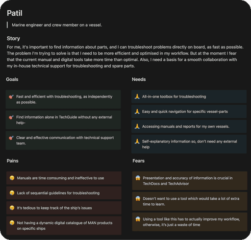
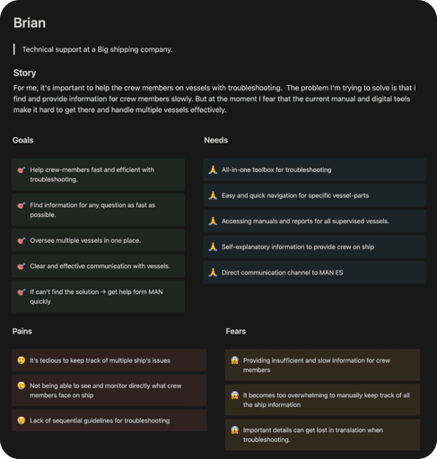
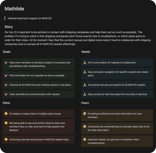
I began the redesign process with crafting a 24-page UX audit document. I reached to internal stakeholders, marine engineers, and documentation specialist for user interviews. I gathered their input on TechGuide and how should it fit into their workflow. Based on this I created three personas.
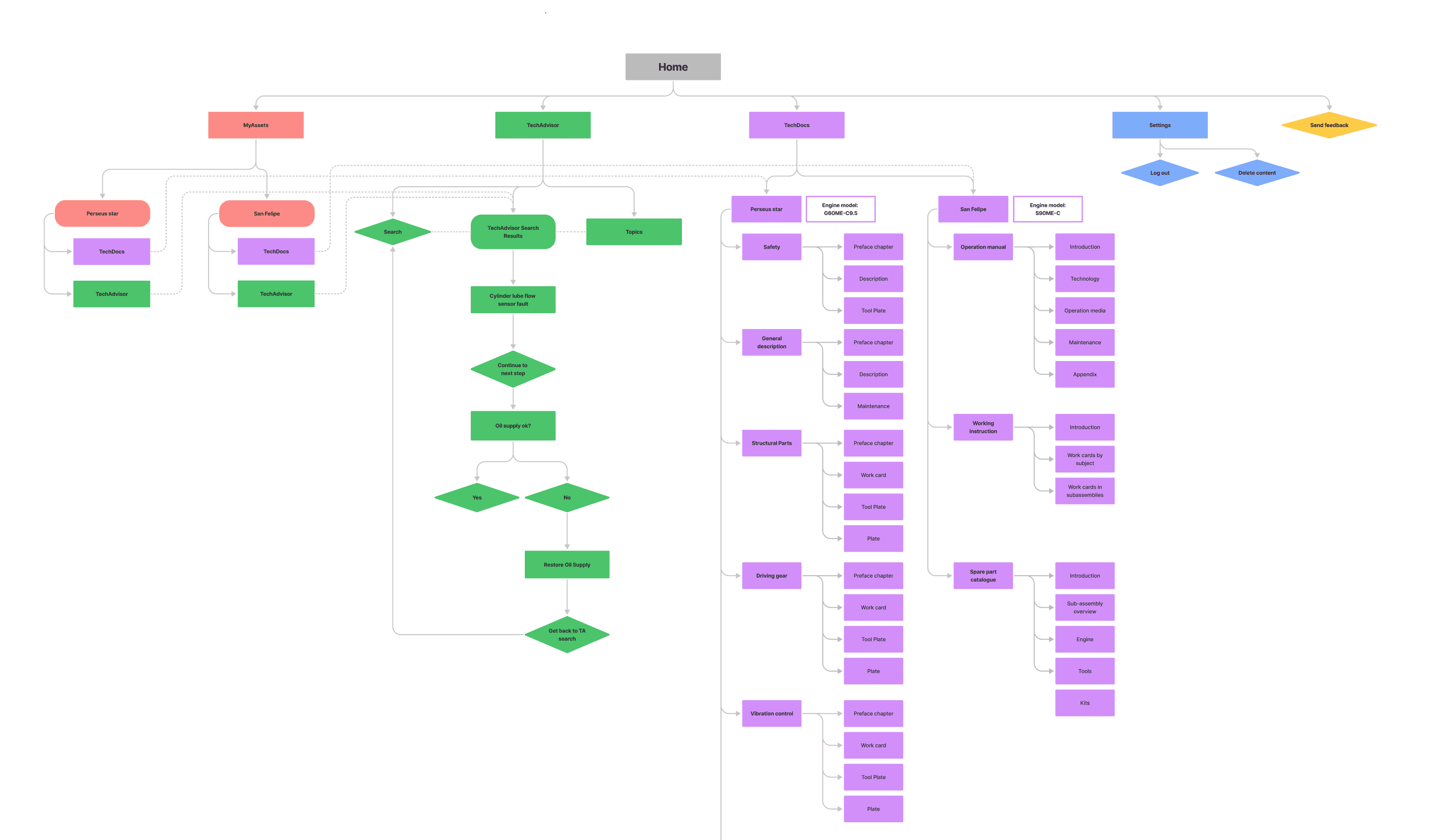
I also went through the app's Information Architecture and highlighted problematic areas.
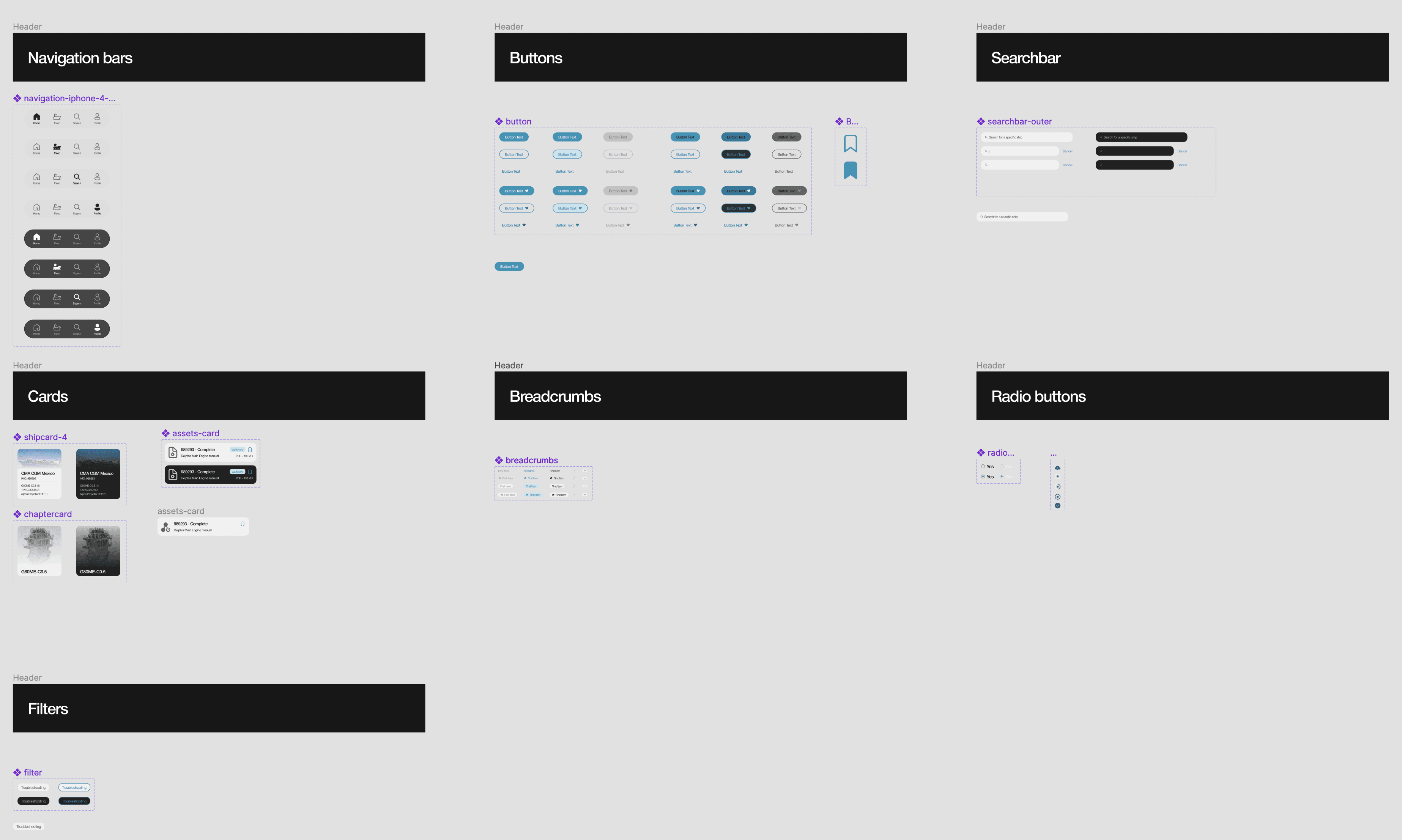
Finally, I deconstructed the UIs and pointed out visual design or interaction errors. Also I created a backlog of existing design components for a future design system.
03. Ideation
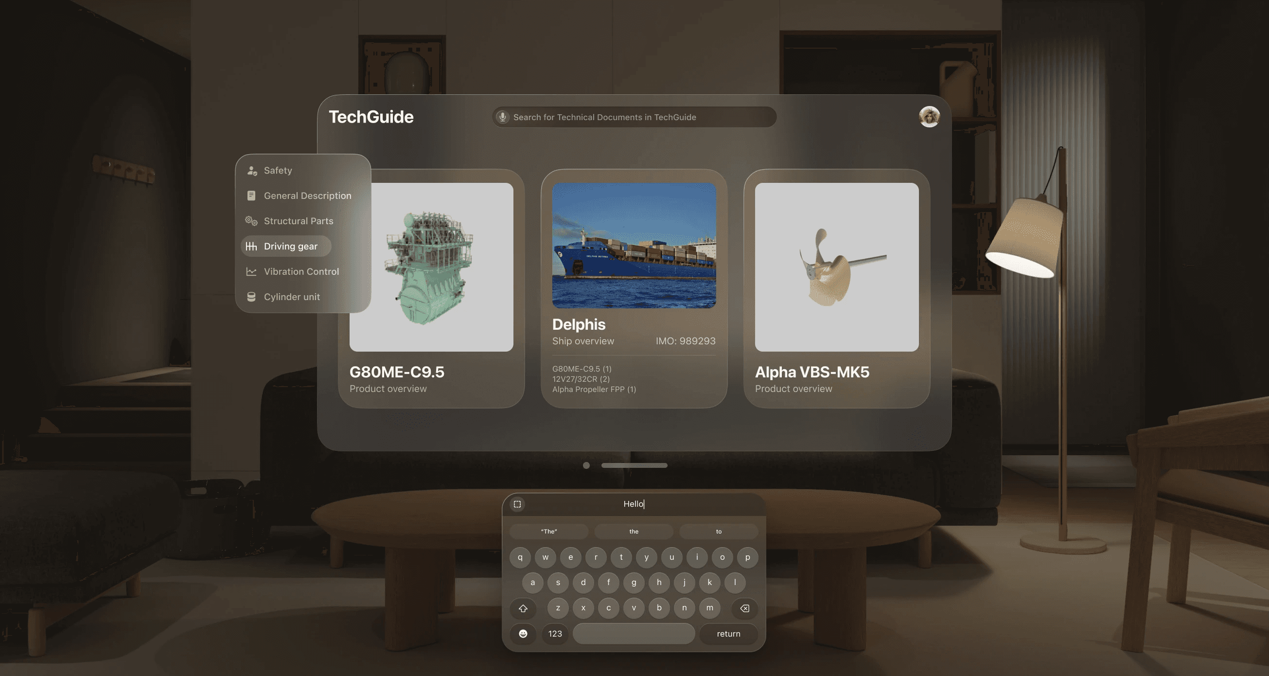
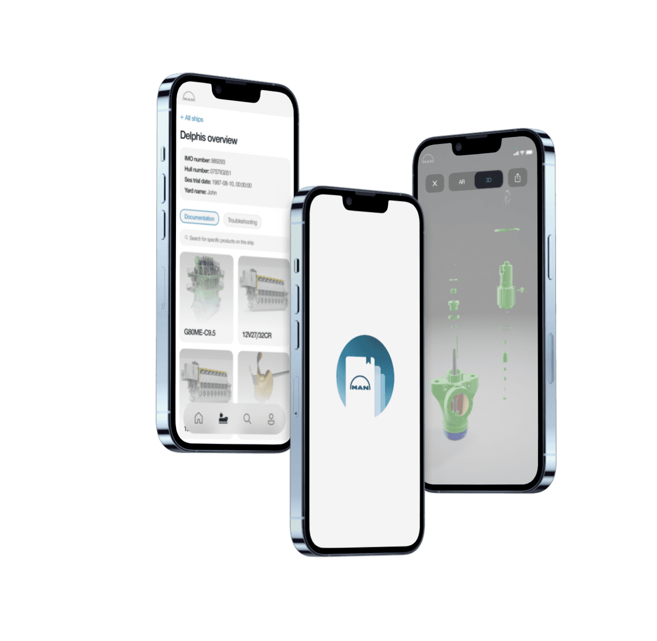
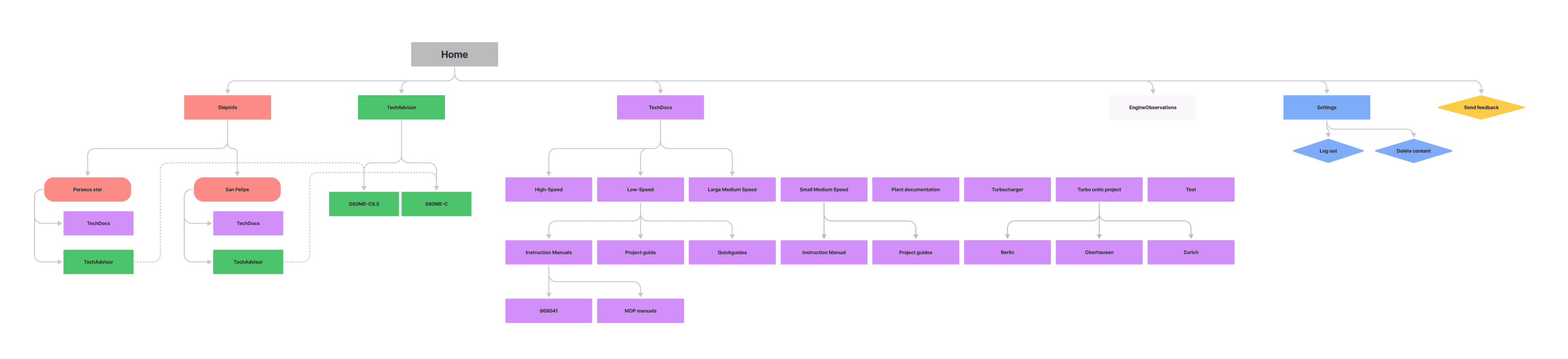
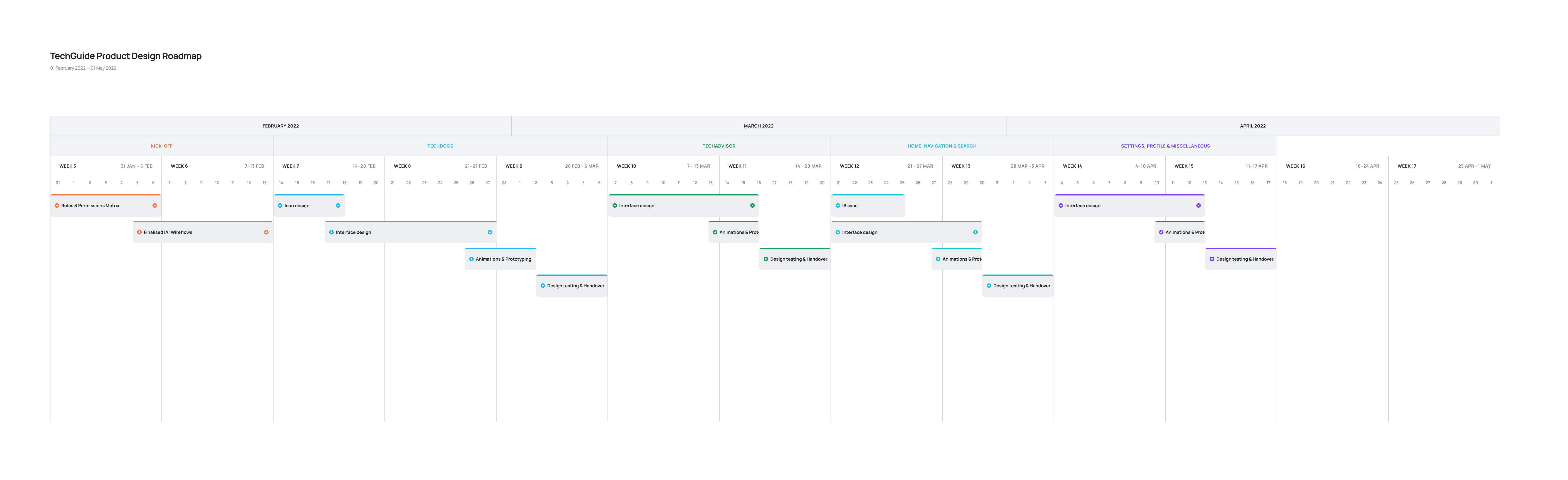
My main driving concept behind the redesign was to go away from the feature-based structure, and integrate each feature under a given ship's overview. As I learned that specific ships are the central reference point in all persona's workflows. This way, all the different user groups would have the same overview of a ship, making it more efficient to collaborate.
Initial sketches
I created simple sketches to show the new structure. I would use this to get early feedback from various stakeholders, and to further elaborate it together with our product manager and developers.
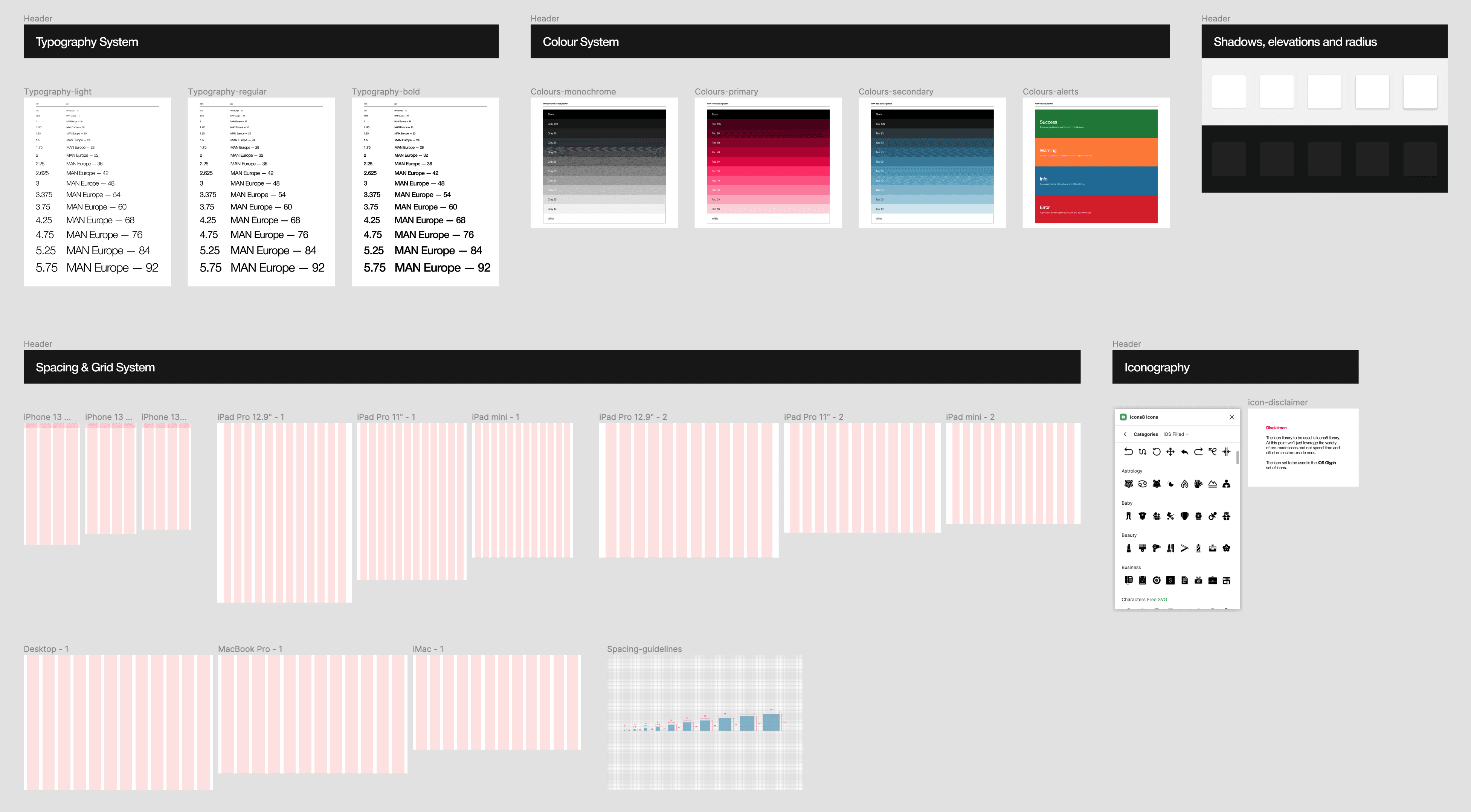
I wanted to introduce a new product language for TechGuide that establishes a subtly functional yet more modern aesthetic appearance. I started to build a design system with creating new visual language guidelines.
New onboarding flow
It was important to introduce users gradually to the redesign. I crafted this onboarding flow to accommodate any possible confusion.
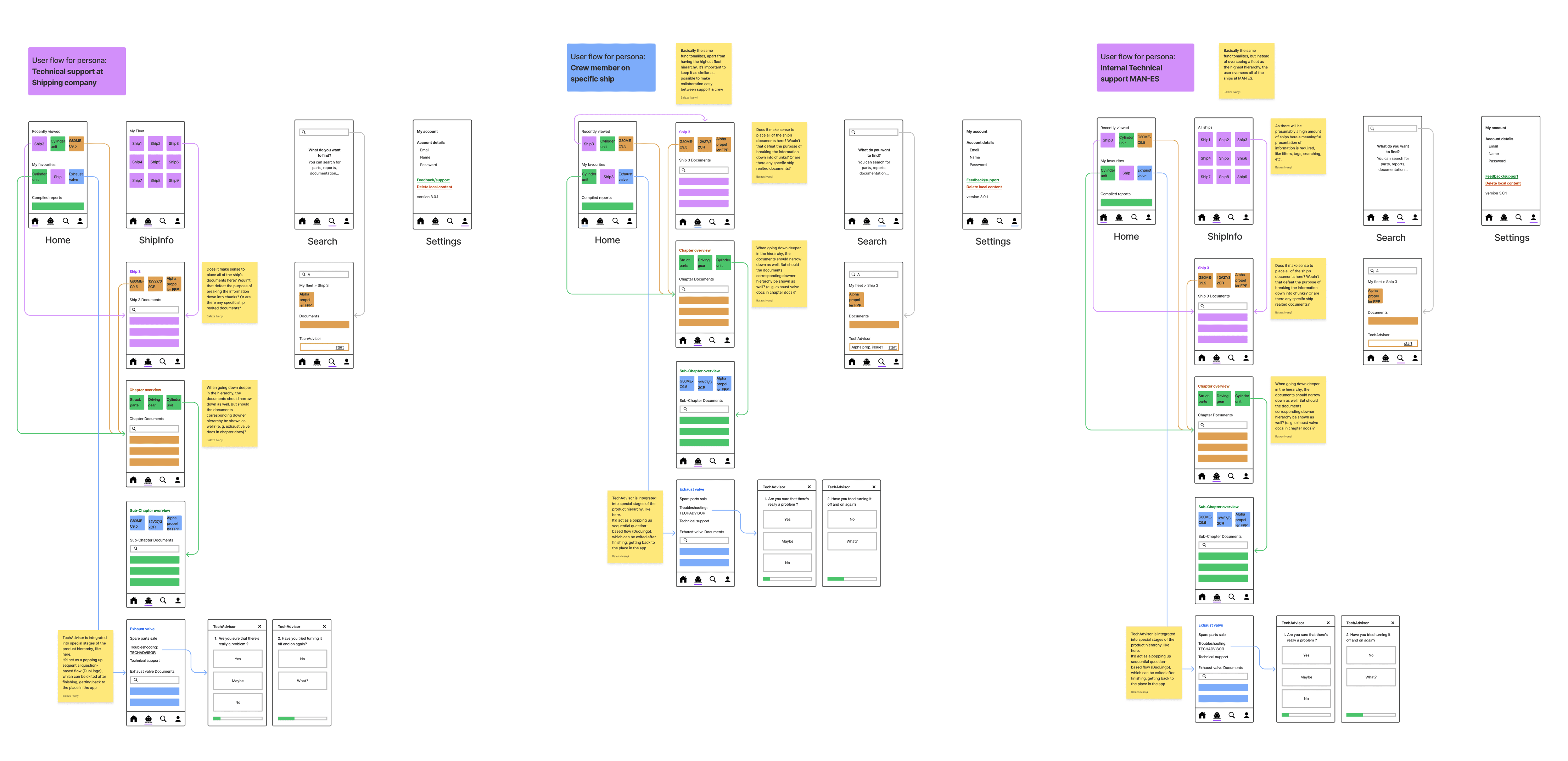
Accessing documentation
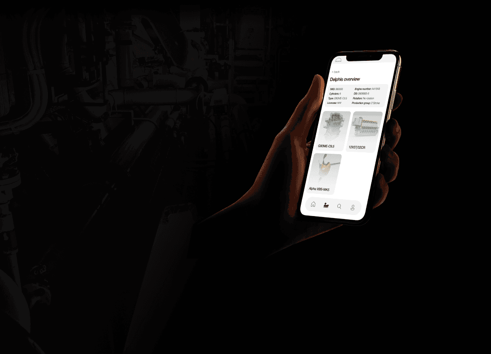
This final flow demonstrates how to get to specific technical documents. Here I wanted to reduce as many steps as possible in the hierarchy, as efficiency and speed is a key factor in marine engineers' workflow. I managed to get down from 7 steps to 4 steps.
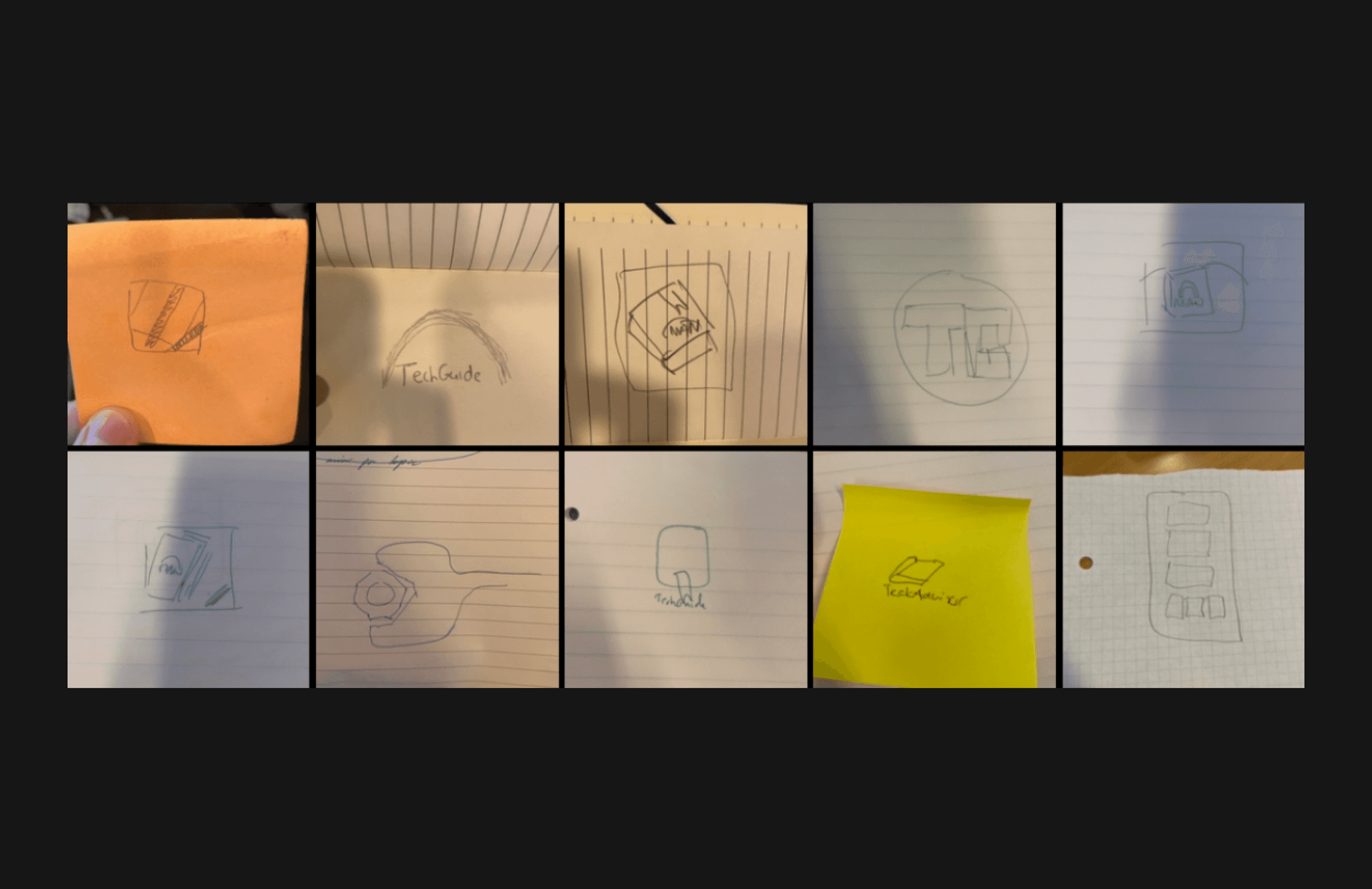
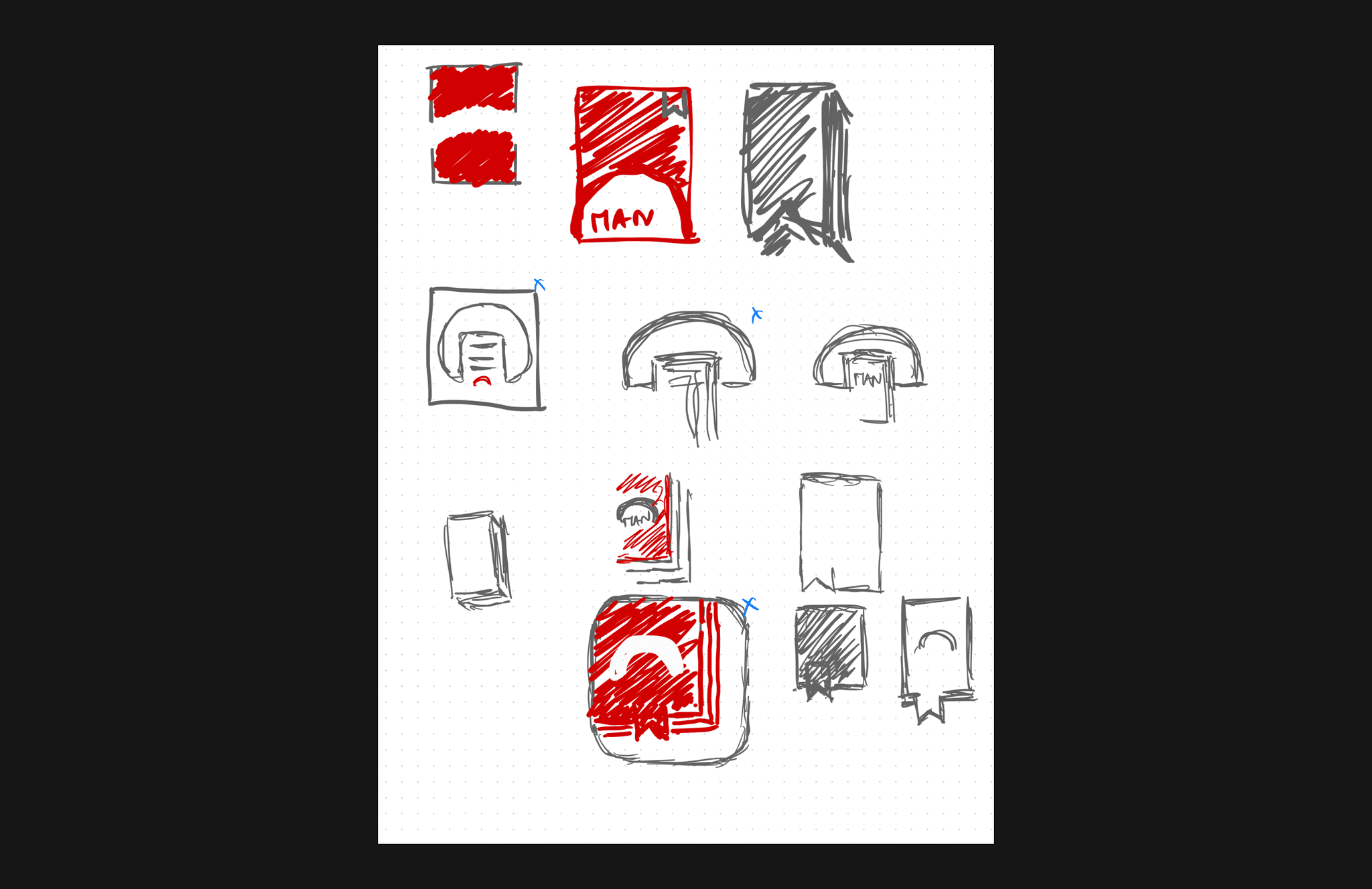
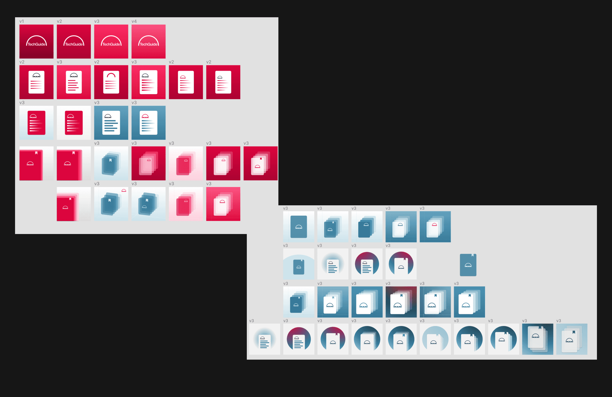
New TechGuide icon
Inspired by Ian Spalter's approach of redesigning the Instagram logo, I followed these steps:
Asking stakeholders to sketch the old logo in 5 seconds.
Analysing the sketches to to see the most memorable elements people recall
Create a new logo based on them which fits the new redesign.
05. Testing & Results
I used Maze to conduct formative and summative testing sessions. It was convenient to embed Figma prototypes to evaluate various user flows before handing over to development.
TASK COMPLETION METRICS
69.2% direct success
15.4% mission unfinished
50.4% misclick rate
23.4s average duration
OVERALL UX OF NEW STRUCTURE
5.9/7
on a 7-item likert scale
QUALITATIVE FEEDBACK
"Overall the system seems user-friendly, easy to navigate and very clear in terms of what you'll find when browsing around."
06. Impact
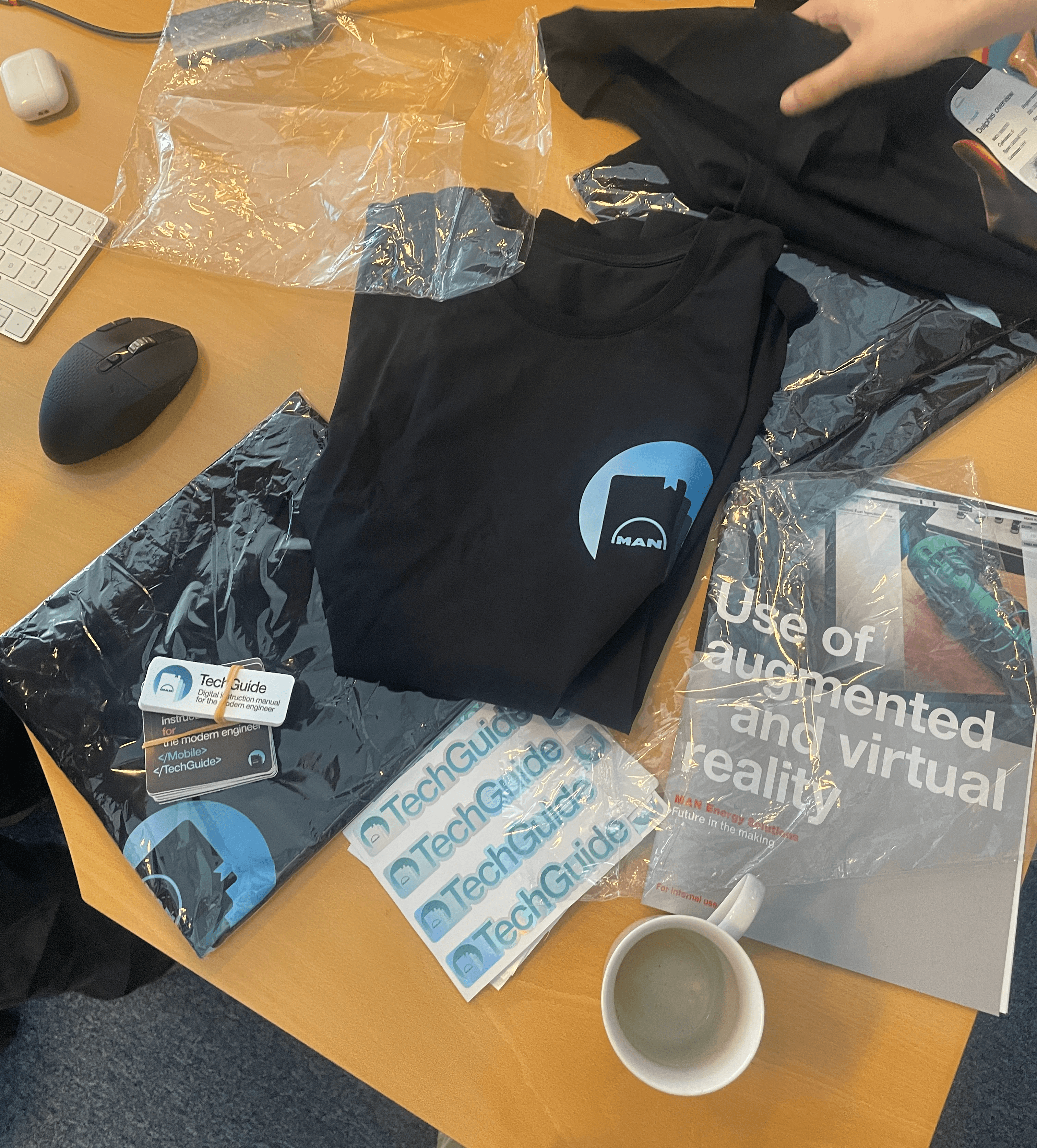
I'm proud of the redesign process that I did with TechGuide, as the app is more frequently used by end-users than before. I'm happy that I could play a role in establishing a product culture in this small team as the only designer. I started bigger things like the design system, and smaller things like creating our first team-merch package.
I'm excited how this team will evolve in the future and implement new technologies in the universe of technical documentation, such as the Vision Pro.